While much has been written about the significance of color management to optimal print output, the topic of adequate lighting conditions for the viewing and evaluation of photographic prints is an important detail that's usually given short shrift.
Tom P. Ashe is an undisputed expert in translating transitory images viewed on a screen to a stunning presence in print. In addition to literally writing the book on this subject with his 2014 title Color Management and Quality Output: Working with Color from Camera to Display to Print, Ashe is an internationally recognized educator who serves today as chair of the MPS Digital Photography program at New York's School of Visual Arts (SVA).
Photographs © Tom P. Ashe
We recently queried Ashe about best practices for establishing adequate lighting conditions in which to evaluate prints, to shed light on (pun intended) both the environmental factors involved and the range of products available to help you achieve best results.
Jill Waterman: How did you first get interested in printing and color management?
Tom Ashe: My interest started at RIT. I was in the Imaging and Photographic Technology program, which was the geekier side of photography, but still hanging out with photographers rather than the full-on imaging science folks. Early on, I was drawn to things around color and how color worked in relation to printing presses, prepress, and such. This was in the early 1990s, just as digital was starting, so I was really tied in with all the new technologies around printing, photography, and digital that were happening at that time. I had pictured what I'd do out of school would be to work at a magazine, like Time, and optimize color reproduction between the photographers and the printing press.
I never did that exactly; I ended up working for Kodak for eight years. In my last 3 ½ years I worked for Kodak Professional, doing everything that was digital at the time. I was working with all their digital cameras and scanners, as well as their printers—from true photographic printers to inkjet and dye sublimation—everything they had. I'd describe it as having a lot of great toys to play with.

Were you working behind the scenes or interacting with customers?
In the late ’90s, say 1995 to ’98, I was in the Research Labs, but close to customers who were using the products, trying to make the color work well for them. That's where I got introduced to the color management tools and other products that Kodak was building. It was a fun place to be, and I made great connections through all that.
So, you really saw the transition from totally analog to digital.
Absolutely. And, I also made a lot of analog prints. That's partly why I appreciate digital so much.
Color Theory
What is it about color theory that fascinates you?
At the beginning, part of what attracted me to color theory were my studies with RIT instructor Glen Miller. He made what could have been a dry topic come alive, and really made people understand and appreciate it. I give him a lot of credit towards sparking my interest, and just being a good teacher. How color works and how we experience the world visually is so integral to what we do as artists and even just as living beings. I think that struck a chord with me as well. There's this right brain and left brain combination about it because there's visual color stuff and aesthetics that we play with as visual artists, but it also has a scientific element.
Do you find there to be a basic connection between color theory and proper evaluation of a print?
Absolutely. If you just start from the basics of color, and what makes color exist, there are three primary elements. There's light, which is what we're talking about here. Then there's the object, and the observer. Those are the three things that are going to affect how color is experienced. Of course, if we don't have light, or the lighting is incorrect, then the color we experience either doesn't exist or isn't experienced as we expect it to be.
 and inside illustration (right) from Ashe's book Color Management and Quality Output, showing how white light is separated through a prism into the visible spectrum, which is a small part of the electromagnetic spectrum.")
Many people believe that holding a print near a window or under daylight conditions is a viable setting for judging print quality. Is that an adequate solution in your opinion?
It definitely can't be the only solution. When we think about light, no matter what, each different part of the spectrum—
Judging Print Quality
Would you say there's an established consensus on what makes the best lighting environment in which to view prints?
I'd say the established consensus is much more related to commercial printing, to make sure that you're viewing prints in a viewing condition that both a press operator and the end user will view under. In that world, there are viewing booths, and certain color temperatures depending on where you are in the world. The standards are much clearer cut than in a fine art realm, or in the photo printing realm. But even in photo printing, a viewing booth, or some sort of controlled lighting situation, have very similar standards, which are generally very helpful for viewing and evaluating prints.
You said depending on where you are in the world. Do standards differ based on geography?
Yes, the color temperatures differ a little bit. In Europe the color temperature of viewing booths is 6500 Kelvin, whereas here in the US they are 5000 Kelvin. Pantone and others make viewing booths for both standards, respectively named the D65 and D50 models.
What exactly does the term Kelvin mean?
Kelvin is the unit used in lighting to describe the color temperature of a particular light source. In short, the higher the Kelvin temperature (expressed in K), the bluer the light will be, the lower the temperature the yellower, more orange, or redder the light will be.
Would you say there's a difference between commercial and fine art printing and the subjectivity involved in judging color for a fine art print?
So, this idea of subjectivity: There are going to be subjective things, but when looking at and evaluating a print, the light and sometimes the evenness of the light is also going to matter. Good light will be light that's consistent, meaning even and consistent in color temperature, and bright enough, having enough illumination and enough energy in all the parts of the spectrum. Not necessarily perfectly the same, but at least with enough energy in all three parts of the spectrum.
When you break down the elements of color temperature, which fluctuates on the Kelvin scale, and aspects like evenness and brightness, it seems to me that there would be some degree of subjectivity based on an individual's preference of a warmer versus colder color temperature. Do you agree?
Subjective tastes would definitely be a consideration. But when I think about evaluating prints, in addition to having a bright enough light and the right color temperature and issues like that, another thing to consider are the conditions under which the print will be viewed in the end. Try to keep in mind how that print will be viewed if it's going to hang on a wall, not just the necessarily perfect conditions from a commercial standpoint. If you know the answer to that question or have an idea of the type of lights that will be used, that's always a good place to do some evaluation, under that light source if possible.

Analog vs Digital Print Evaluation
So, let's talk about the difference between analog and digital. Do you find this to have any effect on the evaluation of prints?
I'd say those major factors I just talked about are still going to be important, because even in the analog days you still had to evaluate based on a given light source. When I was doing color printing in darkrooms, whether it was at RIT or Kodak, you wanted a light source to view and evaluate the prints as you were making them. And once again that light source had to have enough brightness, an adequate color temperature to allow for a good range of the spectrum. Everything I did was 5000 Kelvin, and with bright enough, and consistent, uniform light. I'd still say that's the case in an optimal sense, whether it's digital or analog. So, I really don't see a big difference. I mean, there are differences in the prints, and the aesthetics, and the gamut between inkjet versus chromogenic prints. But in making and evaluating prints, I think it's still the same.
Do you think accuracy in color printing has become easier with digital?
For me, getting to the right print has always been easier, and more possible, with digital. I always felt like I was chasing my tail a bit more with darkroom color printing. It's definitely much more straightforward for me to get to that final print faster. You still need to evaluate the print itself, and you're still going to have some adjustments, but there are definitely far fewer iterations with digital.
Do you think it's easier because the increments are smaller with digital and you're able to be subtler with tweaks?
Yes, absolutely. And there's so much more that we can do with selective color edits in certain areas, and parts of the print that would be impossible in analog. And also dealing with dust.
Environmental Factors Affecting Print Evaluation
Are there correlations to be made between the brightness level of the monitor one prints from and the brightness level of the light source being used when viewing?
Absolutely. The most common complaint people have about the monitor-to-print match is that the print appears darker than the monitor. There are two problems that usually affect people's workflow to make that happen. One is their monitor is set too bright. Our LCD displays are beautiful bright objects. And if we're trying to make a monitor-to-print match, part of what we need to do is bring the display down to a more reasonable brightness level, which is measured in candelas per meter squared. Typically, we want to be somewhere between 80 and 120 candelas per meter squared, depending on the brightness of the room in which you're working.
That's the first part. The other part is how the print is being viewed. People typically hold their print up next to their monitor. While the monitor is this bright glowing object, the print has little to no light falling on it except for the monitor illumination. That's definitely a big part of the issue.
Another factor to consider is the ICC profile we build or that the paper manufacturer builds for our printer and paper combinations. Those are built for a certain amount of luminance it's assumed the print is getting, the amount of light the print is seeing. So, typically, part of the issue with monitor-to-print match is that we're not viewing a print under a bright enough light source.
Does the age of a given light source matter when used to evaluate print quality?
It does, in that light sources or bulbs have a finite life. They will give out, and as they get closer to the end of life they display characteristics of changing color temperature, and flickering, or doing other things. So, in that way, the age matters.

When working with the computer monitor or the lighting used to evaluate prints, are there best practices to keep in mind in terms of measuring the light?
For people doing a lot of print evaluation, I guess you could do some measurements of the light source to make sure that it's still consistent. I've never seen people do color temperature meter readings or things like that to try and evaluate the light sources they're viewing. That would be beyond how I'd do it. But I definitely think one should watch the light sources and make sure that bad bulbs are replaced, because sometimes we might be evaluating under an adverse condition without noticing.
I think just making sure things are bright enough is a big step in the right direction, yet some light booths, such as GTI models, record usage time to help you determine when to replace the bulbs.
What about adjustments to general room lighting adjacent to the computer monitor or adjacent to a viewing station or other area where a print is being evaluated?
There are definitely standards when it comes to lighting around the monitor. The International Standards Organization (ISO) would say it's better to work in subdued lighting for viewing and making color critical choices on your monitor. You don't want total darkness, it's better to have some light in the room, and the recommended measurement would be about 60 Lux. You can measure this with a Sekonic light meter by changing the setting from f-stops and shutter speeds to Lux.
When evaluating the print, it's useful to avoid mixed lighting. Here at SVA, we've got overhead fluorescent lights that we can turn on for the room to be a lot brighter. But if we're really trying to evaluate for print quality, we'd typically turn those off and only use either viewing booth lights or lights that simulate gallery lighting.

What about the general conditions of the room, like the wall color?
You definitely want neutral colors around. What we see and any color we experience are very much affected by what surrounds us. There's a visual phenomenon called simultaneous contrast. For example, if we surround a print with saturated colors, we won't notice the colors and subtle color differences as much as if we surround the print with neutrals. So, it's definitely important to have neutral walls and neutral areas, at least for the evaluation part, to help minimize the effect and spillover of other elements that might be impacting the environment. For example, GTI vinyl latex paint comes in varied shades of neutral gray, which are ideal for use in rooms where prints are being evaluated.
And perhaps one should also not dress in bright colors!
Right, exactly. Because colors can reflect off you and impact what you're looking at. So, of course for me in New York, it's no problem. I'm wearing my nice dark gray and black today, so I'm fine.
What about paper choice? Does paper choice play a big part in the evaluation of a photographic print?
It does. The color of the white of the paper has a big impact and will change the print, or the color that you see. You're changing the white point of the image, so if you have a paper with no optical brighteners, which is not a bad thing, and something I highly recommend, it will be more yellow, which will affect the overall image. A paper with a lot of optical brighteners that reflect in the ultraviolet wavelengths and give some energy and reflectance that way, will also affect the color we see. So, the paper itself and the resulting color cast definitely have an impact.
Would you say there are best practices to keep in mind about what kinds of papers to choose, or types of papers to avoid?
That's tough, because there are reasons to use many different kinds of papers, but if you're trying to make a print that's meant for exhibition and sale, longevity is important, and optical brighteners are one of the factors. In that case, I try to use papers without optical brighteners, which will fade as the print ages. I'd rather start from a more yellowish white and be consistent over time. That's a very different topic in some ways, but I'd rather start from how the print will continue to look for many years to come.
Lighting Setups and Viewing Booths
Let's talk about the different types of options for creating a viewing environment. Can you make recommendations for a good, better and best type of lighting setup?
For a basic-level setup, the first step is to have an area where you've got a nice uniform, neutral environment, as well as having a directed light source that's the same, or similar to, the final viewing conditions for the print.

As I mentioned above, a good place to start is to think about what the final viewing condition of the print will be, such as where the final print will hang or be viewed, and trying to mimic that. At the next level, you should really try to think about the elements for setting up optimal conditions, what light source to use and so on. If people think about those issues and do the best they can to consider the neutrality of the space and the brightness of the light, and to understand that the light source matters, that will help get them a part of the way there.
B&H offers three different types of print viewing lights: Overhead luminaries, desktop viewers, and viewing stations. How do these various types of light sources relate to adequate conditions for evaluating prints?
That would be a way to break it up, so you have some directional light source. The issue with some of the more basic types of light sources is uniformity. I mean, they will work, and they are bright enough as a task light, but a lot depends on how you're using them with other things around. At least it's a directional light and you're not trying to view the print in a dim room, next to a monitor, which is the worst solution.
What do you recommend for people seeking a higher-end solution for viewing and evaluating prints?
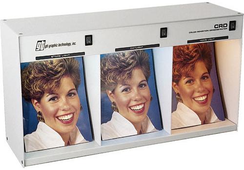
The more basic viewing booths, such as the Just Normlicht colorFrame 02 Desktop Viewing Station or GTI's PDV-1E Desktop Print Viewer, have open sides that allow light to come in. Those are a little less expensive, so that's what I'd recommend as a second-tier option. And then the versions that block the sides are the best.
I've been a fan of the different types of GTI viewing booths for a long time. These booths provide a standard for the color of the light, plus a bright enough light, and uniformity all in one place. Some GTI models even record usage time of the lights to help determine when to replace the bulbs.

The higher-end GTI light booths are enclosed at the sides to block stray light, so they work even if you're evaluating prints in a room with crazy lighting. It's sort of like a hood on a monitor, you're blocking out ambient light, so it has less of an impact on the print you're evaluating. The GTI PDV-2e/SW Professional Desktop Viewer and PDV-3e/SW Professional Desktop Viewer are more or less the same design, it's just that one is bigger than the other, so it's more about the size of the prints you're making.
What type of bulb is used in these kinds of dedicated viewing booths?
You need a special fluorescent bulb to get the light to D50 or Daylight 5000. You can't replace these bulbs with anything you can find in a hardware store. However, B&H sells replacement bulbs for both GTI and Just Normlicht viewing stations.
Are there other types of bulbs one can consider using for evaluating prints?
I haven't done enough research on this yet, but I think the big thing is seeing what the newer types of LED bulbs could do. Of course, those are interesting from the environmental side, and they're being used more in gallery settings as well.
How recent is the switch over to those kinds of LED bulbs?
I'd be guessing, but I think we're still in the transition. I'd say most light sources in galleries and institutions are still incandescent, but when doing renovations, a lot of places have been moving to LED-type lights to have a little bit more control over the lighting. Some of those systems are very fancy, and they can do things like dial in color and color temperature, and other interesting things.

While this discussion has focused mainly on best practices for lighting setups when evaluating prints, there are many other essential tools to consider when setting up a color management workflow. Can you offer some parting advice for other types of tools a photographer should consider investing in if they really care about accurate color for their prints?
It definitely starts with the display for me. You want the print in a bright enough condition, but you also want the monitor at the right level, so if you're doing nothing else, you should definitely invest in a colorimeter to calibrate and profile the monitor for that monitor-to-print match. I'm definitely a fan of X-Rite's device, the X-Rite i1Display Pro. I've been an X-Rite guy for a long time.
Additionally, there are a lot of good generic profiles from paper manufacturers, but if it's possible to build your own custom printer paper profiles, that's always the next step. This calls for a spectrophotometer, like X-Rite's i1 Studio entry-level model, or the X-Rite i1 Photo Pro 2 or i1 Photo Pro 3.
The other essential tool is some sort of color checker. The one I use is the X-Rite ColorChecker Passport Photo 2. Having some reference to accurate color in your scene when it's captured is an invaluable resource that everybody should have.
In your opinion, how does the process of making and viewing prints compare with simply experiencing images on a screen? In an ideal scenario, do you think the printmaking process can help someone improve their work?
We're so used to just looking at images on our phones. And, in a lot of ways, it's much more fleeting when we look at images on our screens. It's very quick. What's interesting is just how much less critical we become about what we see on a screen as opposed to when we make prints. When we spend time with an image in print form, we notice the things we'd want to adjust to make better in image. I think sometimes experiencing an image as a print and living with the print can be a great way to slow down and really appreciate what you're seeing.
What kind of setup do you have for evaluating photographic prints? Let us know in the Comments section, below.
